Healthcare App
CloudCure
Client Project
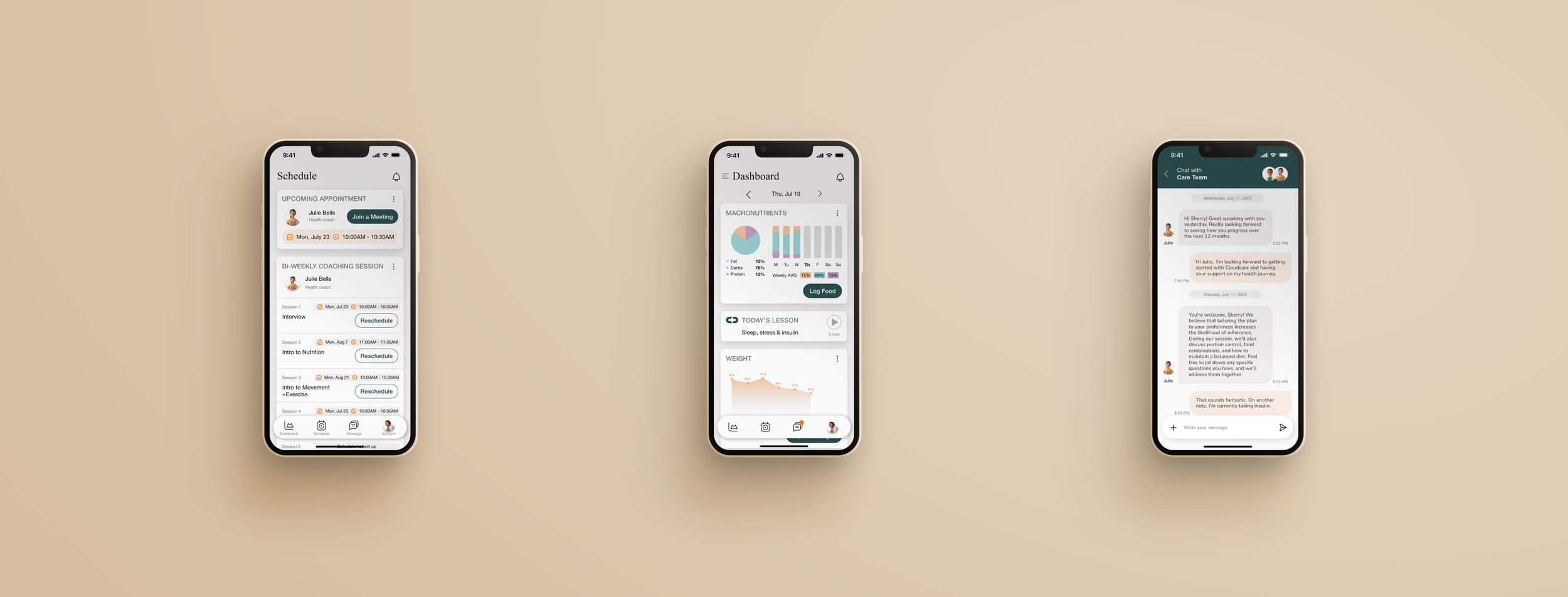
Cloudcure is a healthcare platform providing personalized guidance for individuals with metabolic conditions. To support the platform expansion, I designed a chat feature that allows users to easily message to their coaching team and book virtual coaching sessions.
Client Cloudcure CEO
My Role Product Designer
When 3 Months (2023)
Deliverables
High-fidelity interactive prototypes focusing on appointment booking and conversational interface on mobile app
UI UX design process:
Online survey
Personas
Sitemap
User flows and Task flow
Low-fidelity wireframes
Mid-fidelity wireframes
High-fidelity prototypes
Brand logo and UI kit
Usability tests and findings
Tools
Figma
Optimal
Procreate
Maze
Excel
Client Meeting
How I Took This Project
I leveraged extensive experience with healthcare apps, familiarizing myself with their task flows and UI dynamics.
I seized the opportunity as Cloudcure ventured into an app platform, showcasing my portfolio to highlight my expertise.
In the meeting the CEO elaborated on the brand image and concepts, using their existing website as a reference.
The CEO placed notable emphasis on integrating user research within clear MVP features to validate and enhance user interactions. I underscored CEO's strong commitment to user research as a foundational element in the app's evolution.
High-level mockup screens, which was presented to enhance my understanding of the project's scope and direction. I shared insights shed light on the app's potential, accompanied by a preview of mockup features.
User Research
Research Goal
My research aimed to uncover users' communication preferences, favored app features, and UI elements for personalized guidance.
To achieve this, I conducted an online survey with several benefits.
1) to gather quantitative data for a clearer understanding of user needs and preferences. 2) the online format facilitated greater participant engagement, resulting in a larger sample size. 3) the online survey streamlined the screening process, ensuring suitable participants for more accurate data collection.
Participants
In recruiting participants with metabolic conditions or healthcare app experience, my aim was to tap into specific insights. Cloudcure targets these conditions, making their input vital. Moreover, participants familiar with healthcare apps are well-equipped to assess which features and UI elements are effective solutions. This combined approach ensured that the research outcomes aligned precisely with the intended user needs and the app's objectives
Findings
6 out of 11 participants feel very comfortable, while 3 feel somewhat comfortable, engaging in digital communication for personalized coaching and support.
Participants' Preferred Features:
1. Chat feature 2. Scheduling 3. Find a doctor
Preferred Modes of Communication for Coaching and Support:
- Video calls: Preferred by 87.5% of participants.
- Text/chat messaging: Preferred by 87.5% of participants.
- In-app messaging: Preferred by 75% of participants.
9 out of 11 participants expressed interest in the Cloudcure app, while 2 participant felt neutral about it.
Defining Problem
Crafting a POV and HMW allowed me to reframe the challenges as opportunities for innovation. Additionally, creating a user persona enriched my design process by providing a relatable representation of the target audience, ensuring user-centricity in every decision.
POV
I’d like to explore ways to help individuals with metabolic conditions to provide personalized support and guidance, fostering healthier habits and improved well-being.
HMW
How might we streamline the process of accessing personalized support for users with metabolic conditions?
User Persona
"Finding the time to prioritize my health amidst my busy work schedule is a constant struggle. I wish there was a more convenient way to access regular care and guidance without disrupting my routine."
Sarah Thompson
Age: 47
Occupation: Financial manager (Remote)
Location: Portland US
Context
Sarah has been diagnosed with diabetes and high cholesterol. She manages her condition through medication but it could not make any progress. Sarah is determined to take control of her health and improve her overall well-being. She wants to adopt healthier habits to manage her diabetes and cholesterol effectively to prevent further complications.
Frustrations
Sarah has tried various diet methods and health tips found on the internet but has struggled to find an approach that works specifically for her.
Sarah's busy work schedule poses challenges in finding time for healthcare appointments. Also, Sarah's lack of means of transportation makes it difficult for her to visit clinics regularly.
Needs and Goals
She needs personalized guidance that takes into account her individual needs and circumstances.
Sarah values regular check-ins and support from medical professionals to maintain her motivation, monitor her progress, and receive ongoing guidance to achieve her health goals.
She want to ensure easy access to healthcare resources, appointments, and support, despite her demanding work schedule and transportation challenges.
Story Board
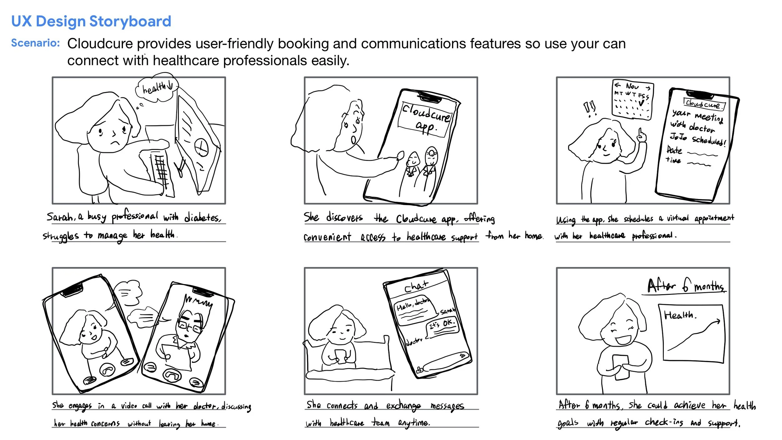
I sought to showcase how Cloudcure provides Sarah with personalized support, easy virtual appointments, real-time communication with healthcare professionals – all from the comfort of her home. By visually narrating Sarah's journey, I aimed to convey the user-centred design principles that underpin the app's creation and how it brings tangible solutions to the forefront.
Taskflow
For each task, I conducted a comprehensive analysis of competitors' screens to help me envision the necessary features for each screen, and ensure a seamless progression from one step to the next
Style Tile
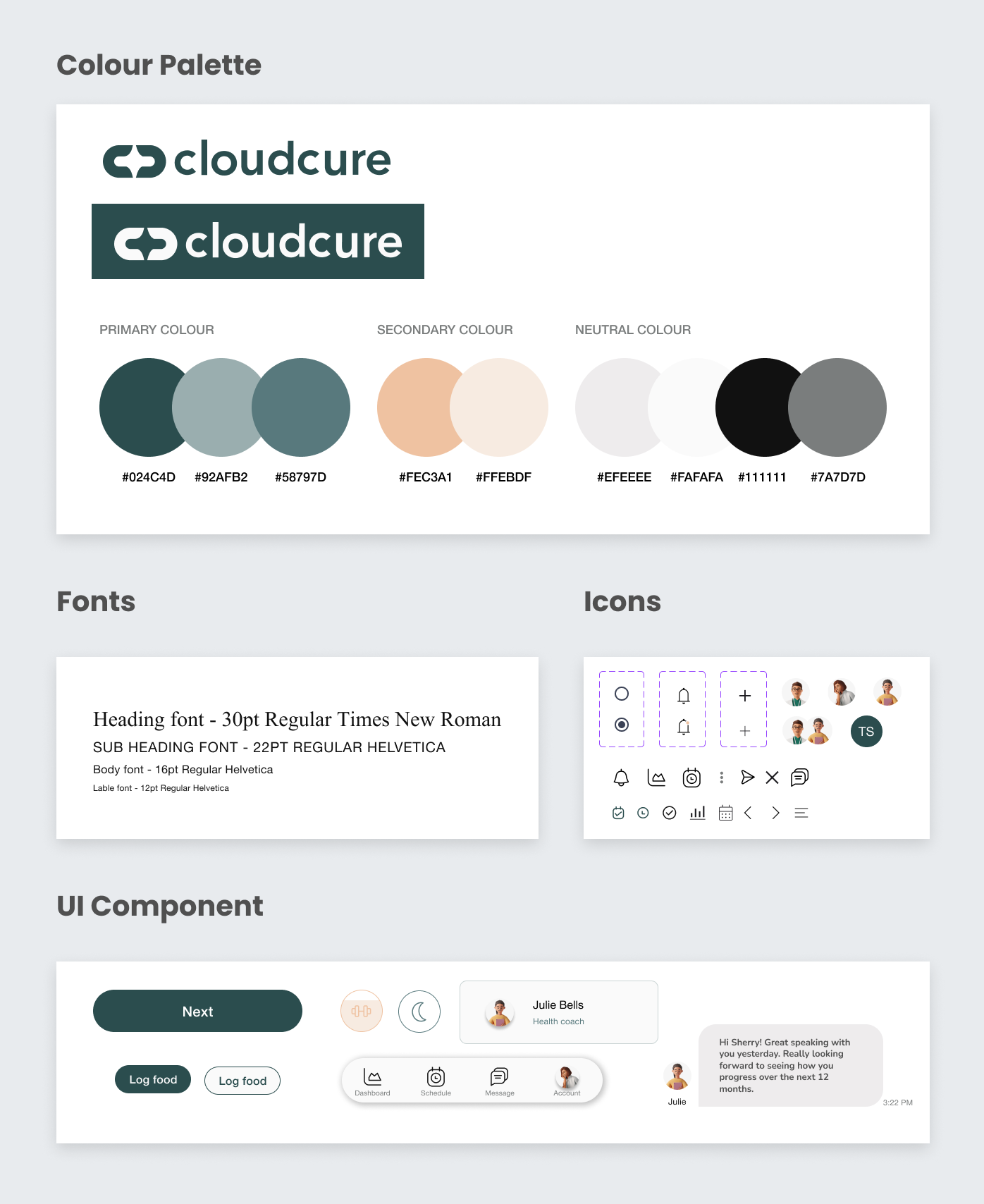
In crafting the style tile for the Cloudcure project, my focus was on extending the established brand identity and web presence into a cohesive and visually appealing app design. By weaving together consistent colour schemes, fonts, and an overall atmosphere, I aimed to create an immersive user experience that aligns with Cloudcure's core values and resonates with its target audience.
Low-fidelity Wireframe
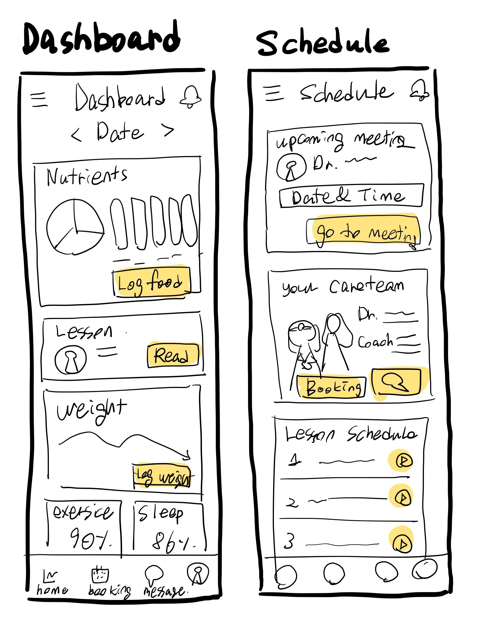
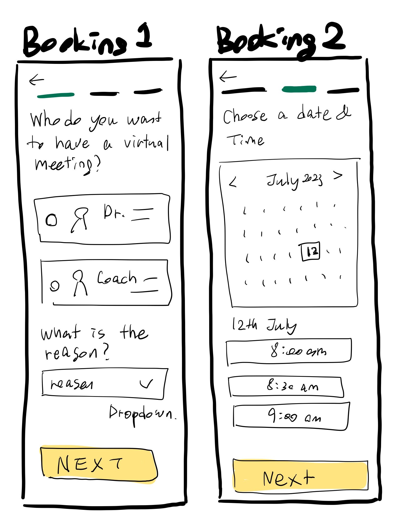
I meticulously integrated user research insights, focusing on user preferences for simplicity and quick access to progress information. These wireframes prioritize showcasing health progress upfront while minimizing overwhelming content.


High-fidelity Wireframe
Crafting the high-fidelity wireframes involved a dual focus on integrating the existing brand identity(Cloudcure) into each screen while also fine-tuning the interface based on valuable user feedback. I strategically emphasized action buttons based on user feedback, ensuring that users can effortlessly navigate and accomplish their goals.
Usability Test
I utilized the Maze platform to conduct unmoderated tests. Prior to the testing phase, I provided participants with an introduction to Cloudcure's purpose and the scenarios for the tasks, ensuring contextual clarity.
11 Participants were selected based on their prior experience with healthcare apps, ensuring the relevance of the insights obtained.
Task 1.
Schedule a Virtual Meeting with Doctor Ando
Success metric : 100%
Usability Scores : 8.5
Findings: The participant faced challenges with navigating the icons and expressed a preference for scheduling virtual meetings by directly searching for the doctor's name.
Task 2.
Check and Reply to a New Message from the Care Team
Success metric : 100%
Usability Scores : 9.8
Findings: The participants requested a larger text size in the chat feature for improved readability.
Iteration
1) Derived from the usability test, testers provided mixed opinions on the intuitiveness of the icons – some found them intuitive while others struggled to understand their meaning. Addressing this vital feedback, I tactically improved the design by incorporating labels beneath the menu icons.
2) Collaborating closely with the client, I shared the usability test results, fostering a detailed discussion that synthesized user insights and the client's perspective. Following client feedback post-prototype review, I incorporated a dynamic change to the scheduling process. Transforming the booking screen into a curriculum-like structure, users now have the flexibility to assign subjects to each session and conveniently view bi-weekly meeting occurrences.
3) Responding to testers' request for larger text size and improved readability in the chat feature, I fine-tuned the design. By optimizing the chatbox's margin, increasing font size, and adjusting font boldness, I successfully achieved a more spacious and legible chat interface, ultimately enhancing communication ease.
Key learnings
Effective Client Communication:
This project taught me the significance of clear communication with clients. Regular updates on the research findings and ongoing process ensured that the development remained aligned with the client's vision. Seeking their input and opinions at crucial stages helped in refining the project's direction and ensuring client satisfaction.
Brand Identity Integration:
The experience of integrating Cloudcure's existing brand identity across different platforms highlighted the importance of maintaining consistency.
Competitive Research Proficiency:
Learning how to conduct effective competitive research enabled me to analyze various healthcare app structures and flows. This process facilitated informed discussions with testers, allowing me to apply the best features and practices to Cloudcure's design.
Next Steps
Expanded Chatting Functionality:
Building on user feedback, I will expand the chatting feature by incorporating voice messaging and enabling users to upload pictures and videos. This augmentation caters to diverse communication preferences and enhances the app's versatility in providing effective support and guidance.
Enhanced Virtual Call Integration:
Aiming to optimize the booking process, I will integrate a virtual call feature directly into the app. This in-app virtual call functionality will seamlessly connect with the scheduling task I've developed, achieving an ultimate goal which is seeking personalized healthcare support.
Elevated Dashboard Collaboration:
Collaborating closely with healthcare professionals, I will enrich the dashboard feature. By ensuring it showcases valuable data for both users and professionals, this step will facilitate insightful health tracking and informed decision-making.


