Redesigned the result page at Samwell.ai, integrating new features and a dashboard to ensure that student users’ needs for academic authenticity are met.
Context
Samwell.ai uses advanced AI to create customized essays and educational materials.
1
Feature Development Initiative
Samwell.ai aimed to develop a new feature based on user requests to distinguish its AI essay products from competitors.
2
User Feedback on Citation Feature
Samwell.ai received consistent user feedback requesting a generation citation feature.
Focusing on features User Needs
Initial perception was to add a simple citation feature to the results page. However, during the sketching phase, realized the feature did not fit well in the user flow and was not inherently useful.
It led me to question deeper —
“why do our users need this feature, and how can it genuinely serve their academic and research goals?”
User Persona & Journey Mapping
In the startup environment, conducting user research was challenging.
I turned to the user feedback we had and my academic experience to dive deeper into our users' needs.
By setting up the persona and building a user journey map, I aimed to follow every step the user takes with our product.
Insights I Gained
Academic Authenticity Concerns
Users not only want essays with good references but are also concerned about the academic authenticity of the results.
Need for Improvement Options
Users need an easy way to fix or improve the essay and references if they don't meet their criteria.
Challenge of Manual Checking
Manually checking every part of the essay and matching references is challenging, indicating a need for a function to ensure essay quality.
As result,
It became clear that simply adding a citation feature wouldn't fully address these issues. We needed a more intuitive design that helps users understand the essay and references, ensures quality and authenticity, and empowers them to control the AI outputs to truly meet their expectations.
I presented insights💡 to the team
I shared these insights with our leadership and development teams, emphasizing that improving user satisfaction could directly enhance our revenue potential. This presentation proved pivotal, as it not only underscored the need for a holistic approach to our design solutions but also convinced the team to allocate additional time to refine our concepts further.
Collaborative Design Solution
I collaborated with Cross-functional teams using user flow and journey maps for effective brainstorming. We employed mid-fidelity wireframes for rapid concept iteration and evaluation. As result, we developed key design concepts:
1
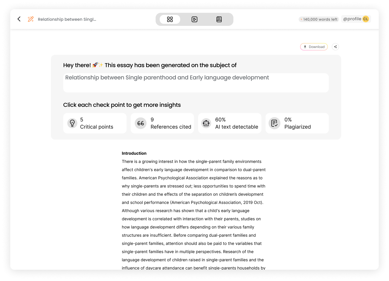
A comprehensive dashboard for essay quality check incorporating citation accuracy, general quality assessment, and AI text detection tools
2
An editable and enhanced user control feature allowing users to easily modify results if they do not meet their criteria, ensuring users can have control over the output.
3
Organized information and interactions into distinct modes on the results page to address the complexity and enhance user navigation.


Challenges Revealed in Usability Test
The internal usability tests uncovered significant challenges.
Our key design solutions did not meet our expectations.
Initial team feedback showed that these modes were perceived as static and not facilitating interaction.
Additionally, users felt overwhelmed by the clutter of information that floated next to the essay text, detracting from the overall usability rather than enhancing it.
Proposed Side-Panel Design Idea
I proposed a side-panel layout to enhance stability and anchor mode switching.
Included dual scrollers in the panel to simplify information comparison and navigation.
Side panel design aimed to make interactions more engaging for users.
But, the Dev Team Said, "This is Too Much!"
Our development team initially had concerns about the complexity and the extensive work required for the proposed side-panel changes.
Competitive Research to address these concerns
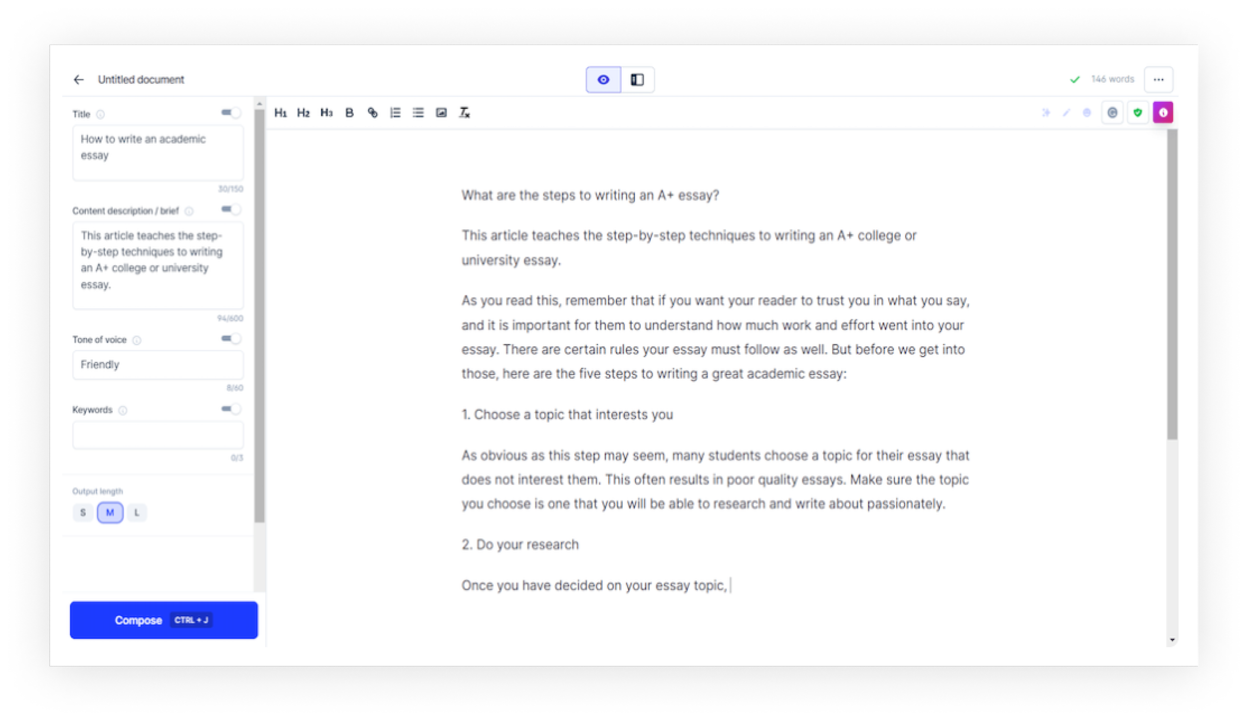
I knew that this design pattern was effective, as it is widely used by many established text production and enhancement tools. I believed it was the optimal solution to address the lack of engagement and the feeling that components were floating. To validate the design's viability and gain support from the dev team, I conducted competitive research on other products like Grammarly, Jasper, and Readable.
This research demonstrated that using side panels is an effective design pattern. It not only allows users to access detailed information about the essay but also enhances user-control interaction, making the experience more engaging.
These findings convinced the team of the design’s practicality and benefits, leading the dev team to decide to build it.
Hi-Fi Wireframe and Responsive Design Process
Overview Mode
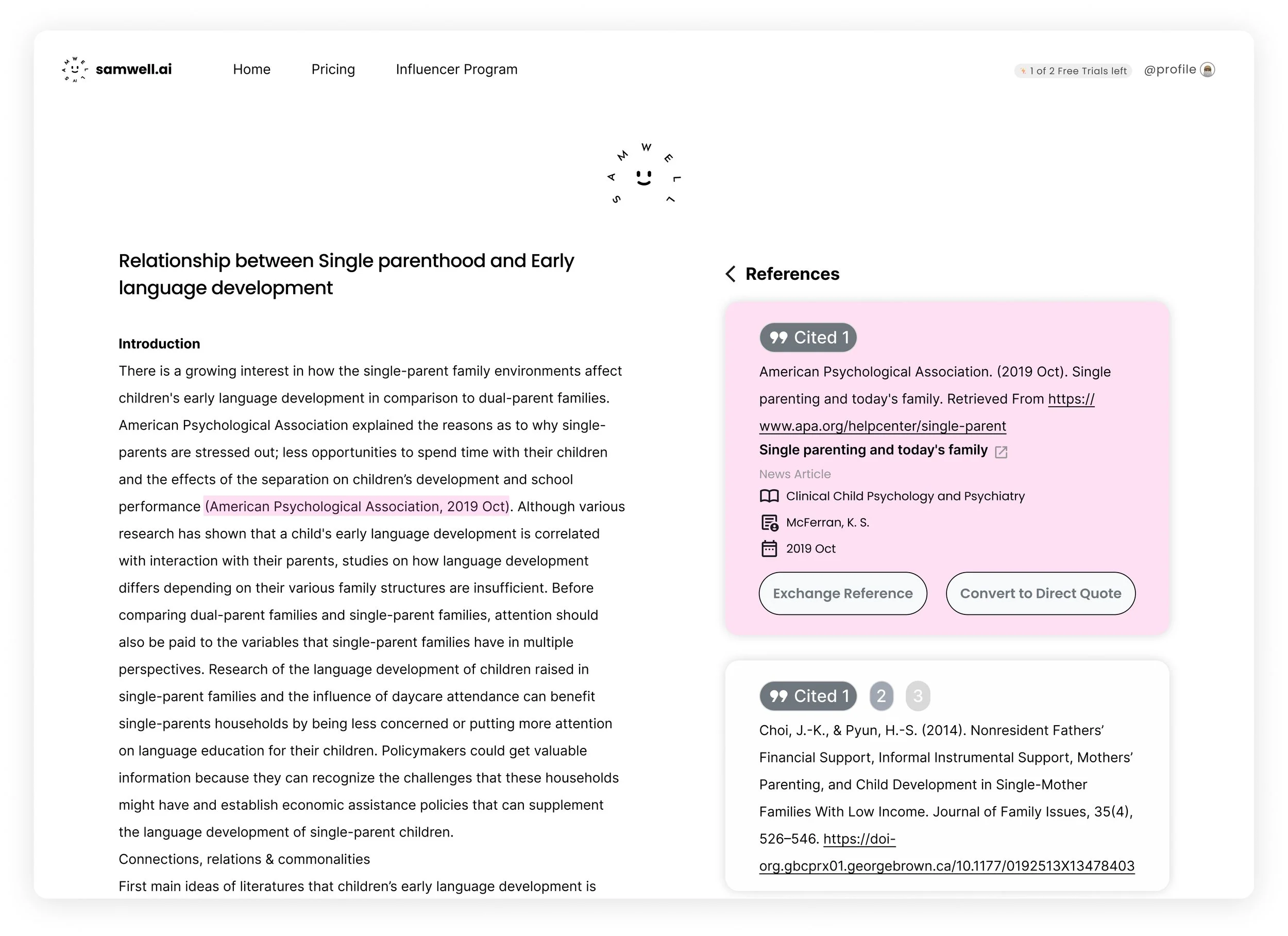
Citation Mode
In creating high-fidelity wireframes for both desktop and mobile versions, a key insight emerged regarding the use of space and layout in different devices. For the desktop version, it was feasible to have a dual-panel layout with the text on the left and modes on the right. However, the limited screen space on mobile devices posed a challenge for this side-by-side layout. To address this, we decided on a switchable screen format for mobile, allowing users to seamlessly toggle between the text and different modes. This approach ensured a consistent and user-friendly experience across devices, while adapting to the unique constraints and capabilities of each.
Final Product
The final product combines an intuitive user interface, a responsive design for all devices, and enhanced modes for Overview, Citation, and Essay Analysis ensuring ease of use and academic integrity. Key features like improved dashboard insights, advanced citation tools, and accessible collaborative elements significantly elevate the user experience and functionality.
Insights I Gained from This Project
Journey Mapping
Meticulously tracing the user's journey at each step, we uncovered their pain points, focusing our efforts on meeting user goals rather than just adding features. This approach helped us design solutions that truly addressed user needs.
Comparative Design Analysis
I honed my skills in making informed design decisions by analyzing similar products. The idea for a right panel was inspired by this research, and presenting real-world examples helped me convincingly communicate its benefits to the team. This process underscored the effectiveness of using existing products as a benchmark for our own design solutions.
Advocating for User-Centric Design
Despite initial resistance due to perceived workload, my persistence in advocating for a dedicated top bar for the results page paid off. By presenting prototypes and emphasizing its benefits, I helped the development team see the value in this design decision. This experience taught me the importance of clear communication and persuasion in achieving user-centric outcomes.


