KIDEA
The resource website for Early Childhood Educators (ECEs)
Personal Case Study
When I was a kindergarten educator, I faced challenges in finding learning resources online. The lack of an integrated platform meant I had to visit numerous sites, without an efficient way to pinpoint exactly what I needed.
This led me to develop Kidea, an educational resource website with a robust categories and tag system, addressing educators' needs for efficiently locating and organizing resources.
Roles
Product Designer
Deliverables
High-fidelity interactive prototypes, showcasing a seamless journey from the landing page to resource discovery. These prototypes demonstrate an intuitive filter and tag system, optimized for both mobile and desktop interfaces
Product design process:
User interview
Persona
Secondary research
Roadmap & Sitemap
Task flow
Low/Mid/High-fi wireframes
A/B test using Mid-fi wireframes
Brand logo and UI kit
Usability tests and findings
Project Specifications
Duration: 3 Months
Tools:
Figma
Optimal
Procreate
Maze
Excel
To address online resource discovery challenges, I designed an educational website with a robust search system, featuring filters and tags for easy resource finding by criteria like age group and theme. The site also includes personalized pages, news updates, and community tools based on educator feedback.
User Research
To delve deeper into my personal struggle as an educator, I conducted one-on-one interviews with other educators, aiming to understand the challenges they face in sourcing resources online
Research goals
Identify the challenges educators face while searching for learning resources.
Discover any existing platforms or tools they currently use for resource discovery.
Gather insights on the features and functionalities they expect from an ideal resource-finding website.
Participants
I interviewed seven early childhood educators involved in curriculum planning to understand their methods, preferred websites, and challenges in finding weekly thematic resources.
Findings
1. Searching for learning resources
Participants typically don't rely on a single resource website; instead, they use Google or Pinterest, typing in specific keywords like age group, play of area, and theme.
Participants click on the ones that seem useful and check if they are accurate, reliable, and relevant
2. Challenges in finding suitable resources
Educators are frustrated by the need to visit multiple websites, some of which are not professionally managed.
It can be challenging to locate and focus on specific activities only relying on the keywords and having to sift through irrelevant content.
They often find it difficult to view comprehensive information about resources on the search results page.
Defining The Problem
Crafting a POV and HMW allowed me to reframe the challenges as opportunities for innovation. Additionally, creating a user persona enriched my design process by providing a relatable representation of the target audience, ensuring user-centricity in every decision.
POV
I would like to create a platform that helps them to effortlessly search for and locate the educational resources they need.
HMW
How might we develop a platform that streamlines educators' search for and access to the desired educational resources online?
User Persona
“I wish there was a way to easily explore a range of creative activity ideas in one place. It's frustrating to spend so much time sifting through websites and not finding exactly what I need.”
Emily Turner
Occupation: Early childhood educator
Years of Experience: 6
Location: Urban Area
Context
Emily is a dedicated preschool room educator who is passionate about providing engaging learning experiences for her children. She often finds herself spending hours searching various websites for creative activity ideas. She wishes she had a platform where she could quickly explore diverse teaching ideas tailored to her learning theme.
Frustrations
Spending excessive time searching for relevant resources online.
Struggling to determine the quality and suitability of resources.
Needs and Goals
Frustration with the time-consuming process of visiting multiple websites to find suitable resources.
Difficulty in finding specific activities due to the reliance on general keywords and the abundance of irrelevant content.
The challenge of verifying the accuracy, reliability, and relevance of the resources she finds.
Solution
Problem 1: Difficulty in Locating Resources
Challenge
Educators find it challenging to locate and focus on specific activities only relying on the keywords in Google or Pinterest even though they considering various aspects like age group, play area, and theme, etc.
Solution
I introduced a filter function with intuitive categories to streamline the resource search process, enabling educators to efficiently refine their search using specific criteria.
Problem 2: Difficulty Assessing Resources on Search Results Page
Challenge
Educators find it hard to determine if a resource is suitable from the search results page alone, often needing to visit each page to assess its relevance.
Solution
On the result page, I added tags to the resources to specify key details such as age group, play area, and theme, etc., allowing users to quickly understand what each resource is about without needing to visit each page
Secondary research
I conducted secondary research to identify precise category names that would be intuitive for educators. This research involved exploring early learning settings and curriculum implementation practices in Canada, drawing insights from sources like The National Association for the Education of Young Children (NAEYC) and the Canadian Ministry of Education website.
My key findings are:
Early Childhood Education (ECE) is categorized by different age groups to ensure developmentally appropriate practices.
The ECE sector emphasizes a play-based approach, where educators observe children's behaviors and interests to tailor programs accordingly.
ECE recognizes various developmental areas. Consequently, play activities are designed to stimulate diverse domains such as art, science and math, language and literacy, physical development, and pretend play."
Sitemap
I developed a sitemap to structure the website in alignment with the needs of educators, as revealed through my interviews. My solution centres on offering well-defined categories and an efficient filter system to simplify resource location for educators. Therefore, the site map is specifically designed to highlight the categories identified in my secondary research.
Task flow
From the user interviews, I discovered that educators primarily use varied keyword forms to locate needed resources. Therefore, in the task flow design, I focused on identifying all possible user paths to find desired resources, including different keyword usage, reliance solely on filters, or a combination of both.
Branding
Brand Name
I settled on the name "Kidea." This name not only encapsulates the essence of early years but also communicates a wealth of creative ideas to support educators and, ultimately, children's growth.
Brand Personality Definition
Exploring
Creative
Connective
Supportive
Logo
For the "Kidea" logo, I've chosen a wordmark style that's engaging and meaningful. The use of the "Opun Mai" font with its rounded characteristics does indeed convey a sense of warmth and friendliness. The incorporation of different shapes in primary colors not only adds to the vibrancy but also represents the diverse and dynamic realm of creativity and learning.
Low-fidelity Wireframe
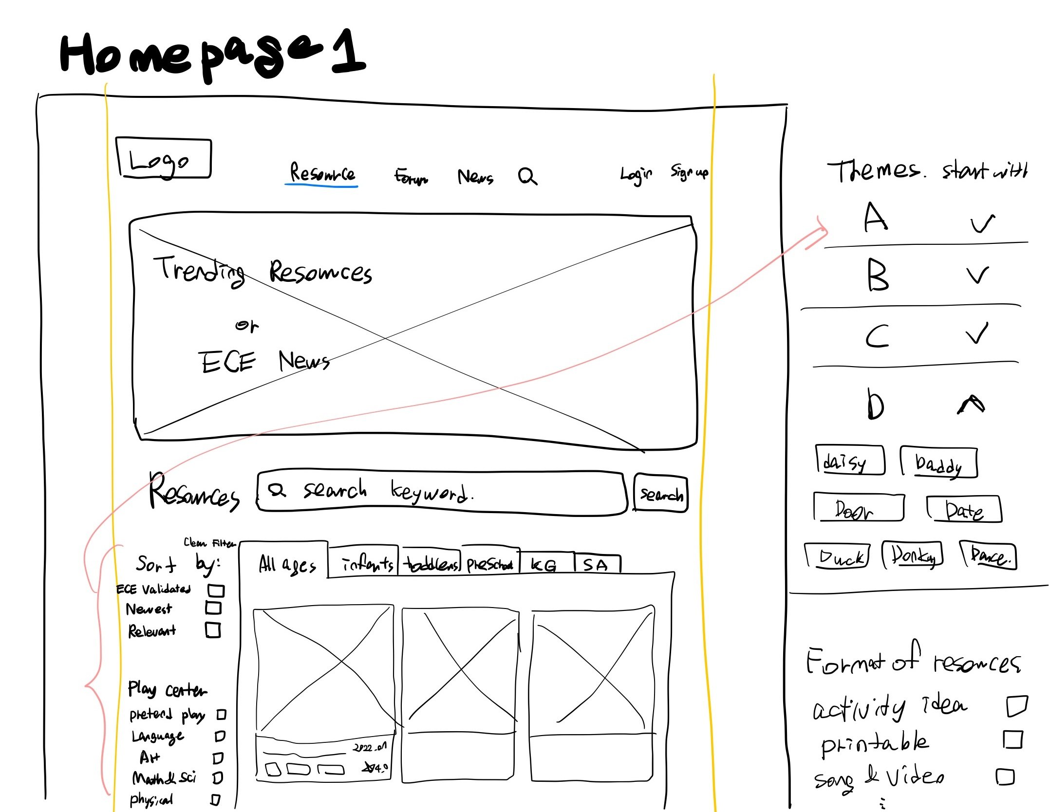
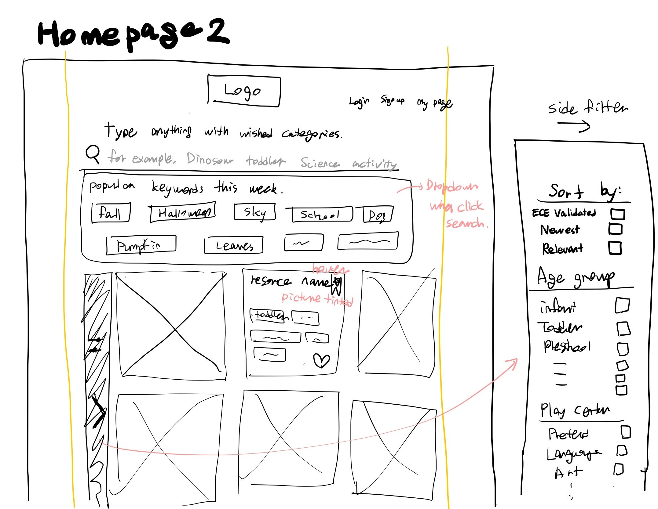
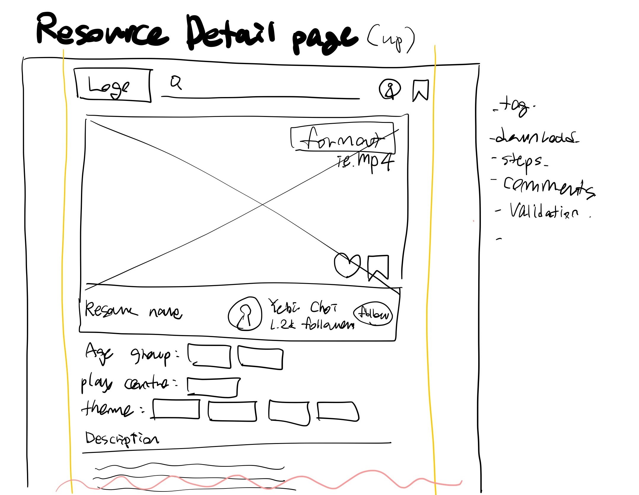
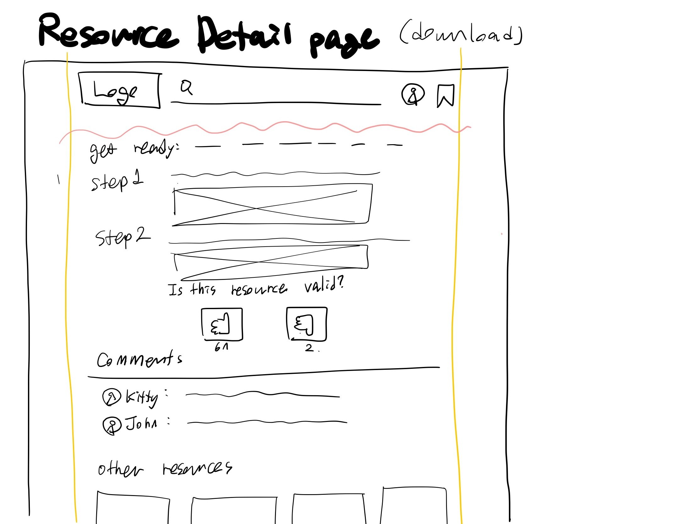
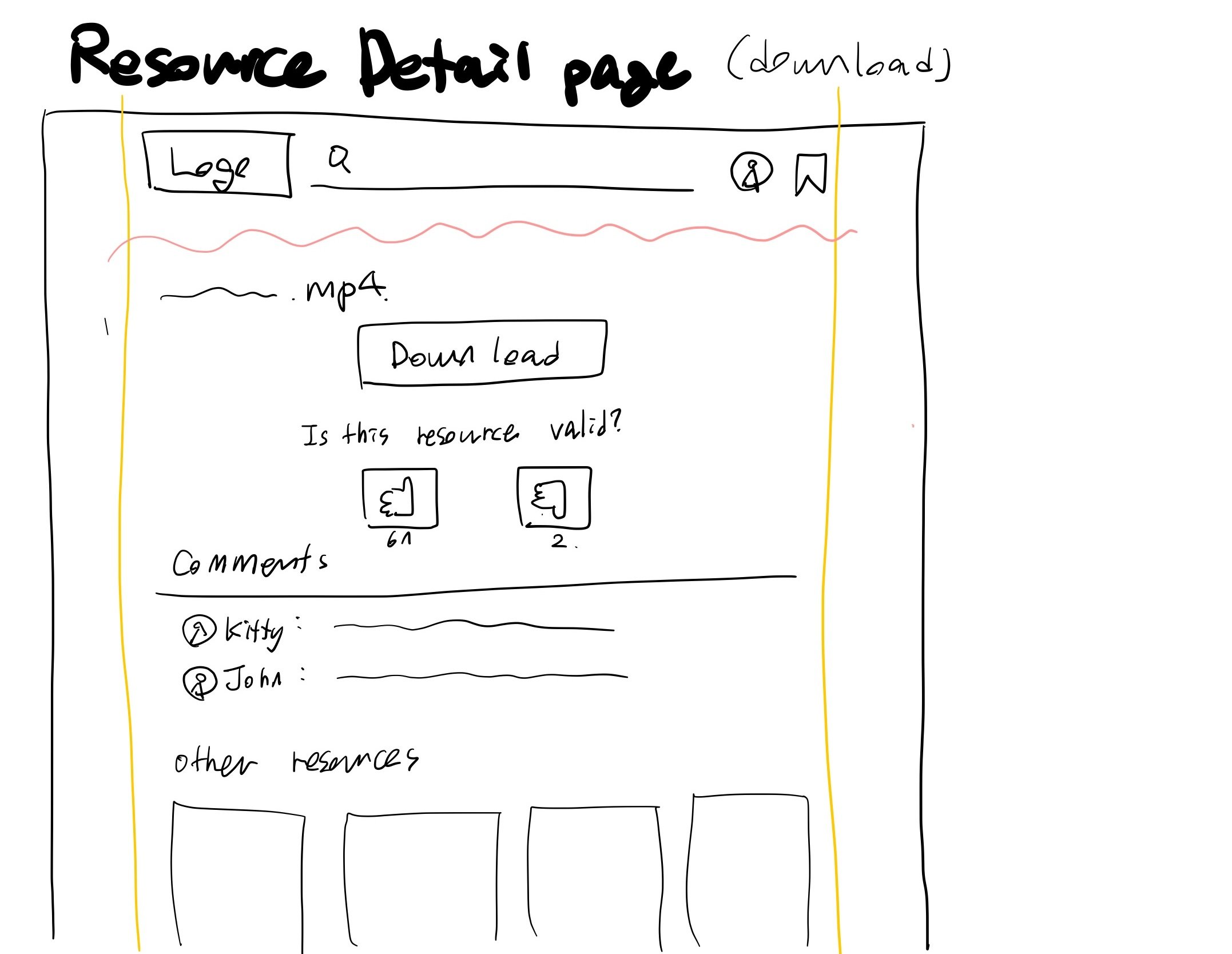
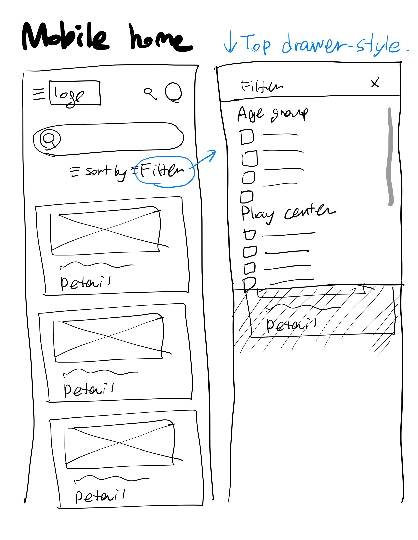
In this initial phase, I crafted sketches for both the landing page and a detailed resource page based on the developed solutions and task flows.
I delved into two design approaches:
Landing Page A: Directly displays filters and resource information, ideal for those who prefer quick access to functions.
Landing Page B: A minimalist design that reveals filters and details through interactions like clicks or hovers.
My aim was to identify which design better meets educators' needs, balancing a clean look with ease of access to information.
Mid-fi Wireframe & A/B Test
Moving to mid-fidelity wireframes, I focused on creating clearer visuals suitable for A/B testing. This phase was vital in collecting feedback that would directly influence the refinement of the user experience.
1. Clarification
Greet participants, outline the session’s goal to evaluate two mid-fi screen versions, and clarify the random presentation order to avoid bias.
2. Initial Impressions
Show one screen version (A or B) randomly and ask for first impressions.
Seek opinions on the organization of information and visual hierarchy.
3. Feature Exploration
Request detailed feedback on specific features.
Encourage pointing out specific helpful or confusing features.
4. Comparison
Encourage side-by-side evaluation of Screens A and B.
Probe for insights on which design better facilitates their search and discovery process.
Insights from A/B test on the landing page Design:
Design preference: 2/3 prefer Homepage A for its information focus.
Inspiration: B's layout similar to Pinterest is partially favorable; desire for more info with images.
Search bar: 2/3 favor Design B’s prominent search feature.
Filters: Hidden filters in Design B are unpopular.
Tag system: 2/3 like it, but want information to be more organized.
Search icons: Confusion over the presence of two icons.
Hero section: 2/3 participants desire updates on news and new activities.
Themes: Alphabetical sorting for themes viewed as unnecessary by all.
Insights from A/B test on the resource detail page Design:
Preference for a 'like' button over thumbs up/down to foster a more positive environment.
2/3 participants found the phrase "Is this resource recommendable for use in your classroom or educational setting?" to be confusing
Desire expressed for a 'download' button placed at the top for easy access, eliminating the need to scroll down.
High-fidelity Wireframe
The high-fidelity wireframes were heavily influenced by the insights gained from A/B testing.
I concentrated on crafting an information-focused design, as preferred by educators.
The goal was to make resource access and actions more straightforward, reducing superfluous interactions and enhancing overall usability.
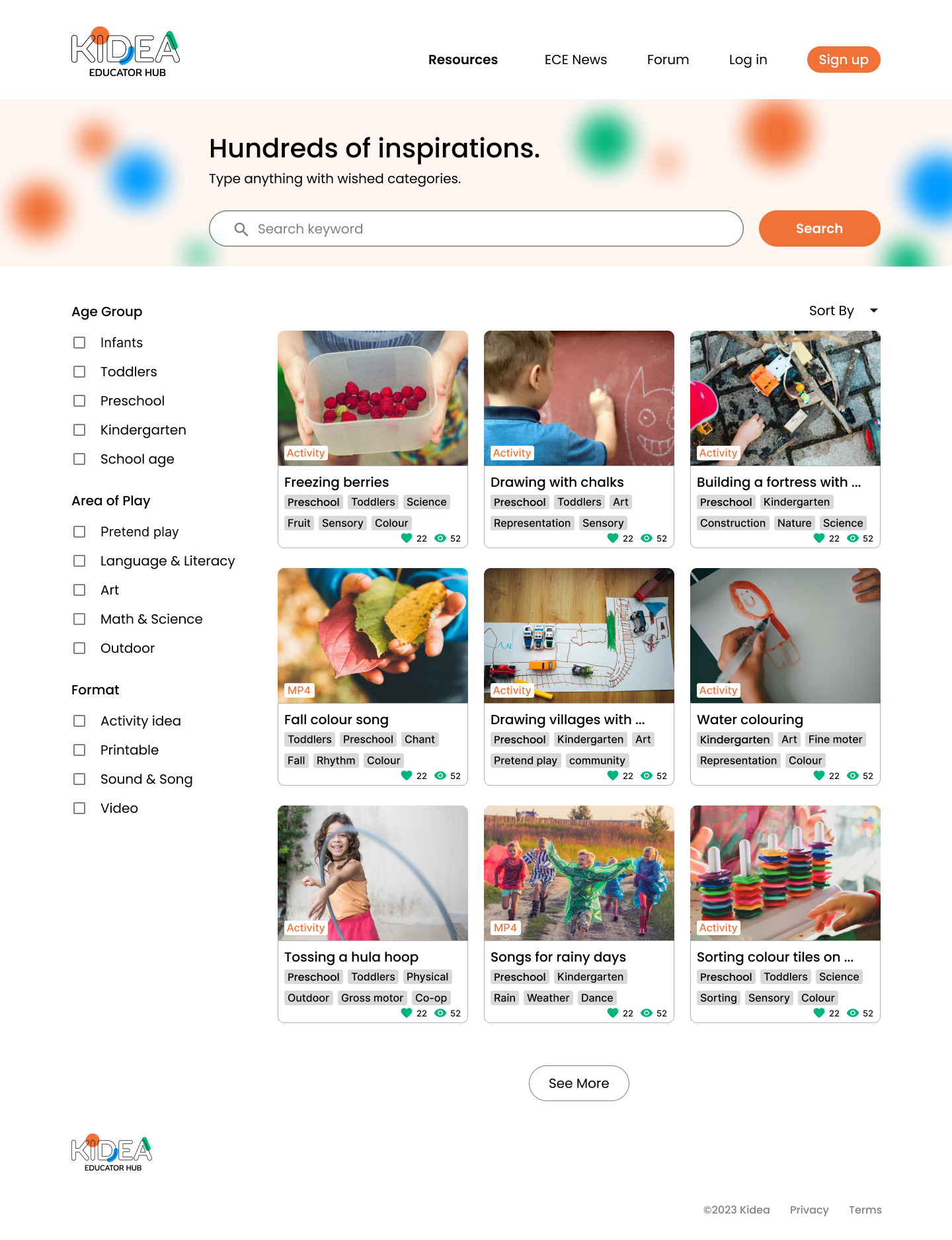
Landing page
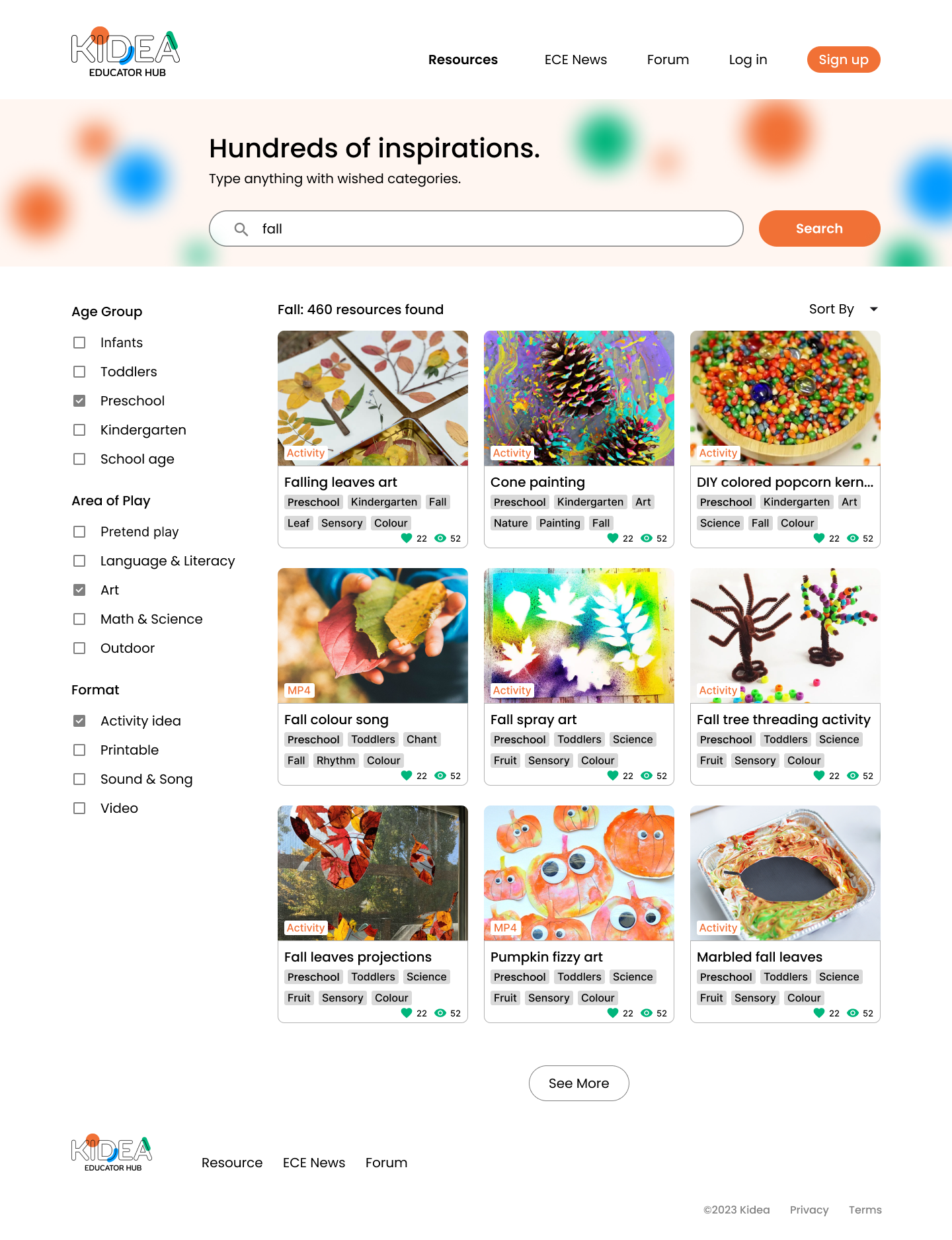
Landing page with keywords and filter applied

Resource detail page (upper)
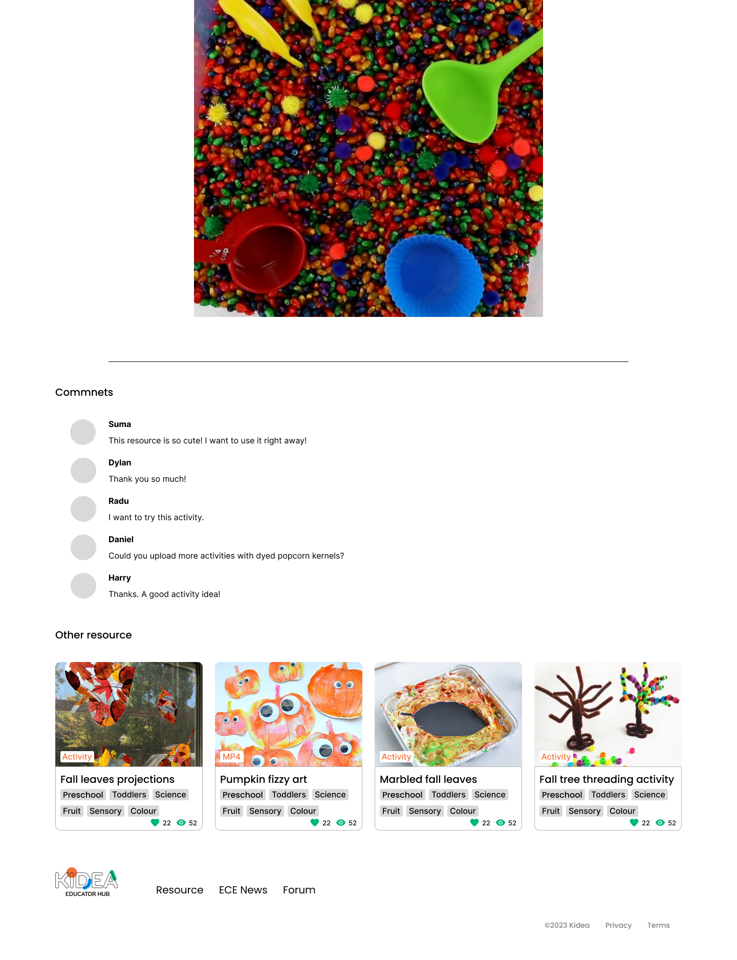
Resource detail page (bottom)
Usability Tests
To enhance the design and functionality of the Kidea resource website, I conducted one-on-one sessions with five educators from childcare settings. During these sessions, I asked them to locate a specific resource within a given scenario.
Positive Feedback:
Participants found the process of finding resources easy and straightforward.
The hashtag system was appreciated as it offered a clear idea of each resource's content.
Positive comments about the filter system, especially its clear categories.
The large images in the detail pages effectively captured participants' attention.
Suggestions for Improvement:
Suggestions for improving the organization of information on detail pages, including the need for structure and more spacing.
Recommendations to enhance categories by reflecting more relevant keywords.
Suggestions to improve the organization of tags, including tag length and layout.
Comments related to the landing page's appearance and suggestions for more content.
Feedback regarding the use of gallery-like formats for images on detail pages.
Questions and Concerns:
Concerns about the search bar in the detail page causing confusion.
Questions and curiosity about where saved resources are stored.
Iterations
Revamped Landing Page Design:
Addressing feedback that the original design resembled a search-results page, I redesigned the landing page to distinguish it clearly from other sections.
The new layout is structured to immediately convey its primary function as a welcoming and informational gateway.
Search Bar Redesign:
To resolve confusion regarding the search bar's location, I relocated it to the navigation bar and in the middle of the page. This change ensures that the search function is accessible from any point on the website.
Incorporation of News and Discussions:
Recognizing educators' interest in staying updated, I integrated a section for recommended news and discussions.
Resource Suggestion:
I've added a feature that shows resources relevant. This offers educators a wider range of suggestions beyond their search queries, enhancing discovery.
Refinement of Filters and Tags:
Retained the filter and tag system, highly praised by users, while implementing wording and design adjustments for clarity and visual appeal.
Expanded Categories:
Enhanced the category range by incorporating additional relevant keywords, broadening the scope for more precise resource searches.
Tag System Overhaul:
Improved the tag organization by adjusting colors and spacing, reducing clutter and enhancing readability.
Responsive Design
News section
In the mobile version, I focused on efficient content presentation. For the news section, The horizontal layout of these smaller news cards optimizes the use of space while maintaining readability and accessibility.
Resource cards
The resource section retains the same format as the desktop version to ensure no information is lost, aligning with educators' preferences for comprehensive content.
Search page
While preserving the hierarchy of the desktop search page, I recognized the challenge of displaying filters alongside search results on mobile.
Filter
I introduced a filter button at the top of the page. This leads to a top drawer-style filter that expands downward, making it simple for users to access and review the filters without cluttering the mobile screen.
Next steps
Personalized Page for Saved Resources:
Develop a personalized page where users can save and organize their favorite resources. This page could feature categorization options, notes, and the ability to share these resources with peers.
Elaboration of the Detail Resource Page:
Focus on enhancing the detail resource page with more comprehensive information, clearer organization, and interactive elements. This could include adding sections for user reviews, difficulty levels, and more detailed preparation instructions.
Enhancing Community-Building Features:
Introduce or expand features that enable community interaction among educators. This can include forums, discussion boards, or a section for shared experiences and tips, fostering a space for collaboration and exchange of ideas.
What I learned
Balancing Aesthetics with Functionality:
My project taught me the delicate balance between creating a visually appealing interface and maintaining functional simplicity. This was especially evident in designing the landing and search pages, where I had to ensure that the design was not only attractive but also facilitated easy navigation and information retrieval.
Adaptability in Responsive Design:
Transitioning from desktop to mobile highlighted the necessity of adaptability in design. I learned to prioritize content, reconfigure layouts, and adjust visual elements to create an intuitive user experience across different devices.
User-Centered Design is Crucial:
Through user interviews and A/B testing, I learned the importance of designing with the end-user in mind. Adapting features based on actual user feedback, like filters and layout preferences, reinforced the need to continually engage with users throughout the design process.


